I designed a suicide awareness campaign featuring posters that depict the hidden struggles people face despite outward appearances. Using the suicide prevention color palette, the campaign aims to help viewers recognize signs and encourage support for those affected.
What I did
Created a series of posters representing the emotional states of individuals struggling with suicide.
Used a limited color palette aligned with suicide prevention awareness.
Focused on visual storytelling to convey hidden emotions behind smiles.
Designed to raise awareness and educate viewers on recognizing warning signs.
Why it matters
Helps break the stigma surrounding mental health and suicide.
Encourages empathy and understanding toward those struggling.
Raises public awareness about the importance of recognizing subtle signs.
Supports suicide prevention efforts through thoughtful, impactful design.
I chose the word “Chaos” for a design project and created book covers for three books with “Chaos” in their titles, combining photography and illustration to visually capture each story’s essence.
What I did
Selected the word “Chaos” from a list of options.
Researched three books titled with “Chaos”: Kitten Wars Kitten Chaos, Patterns in the Chaos, and Chaos and Night.
Read synopses to understand each story’s themes.
Designed unique book covers incorporating photography and illustration for each title.
Why it matters
Demonstrated ability to interpret literary themes visually.
Combined multiple artistic techniques to create engaging cover designs.
Showcased research-driven creative process.
Developed skills in visual storytelling and conceptual design.
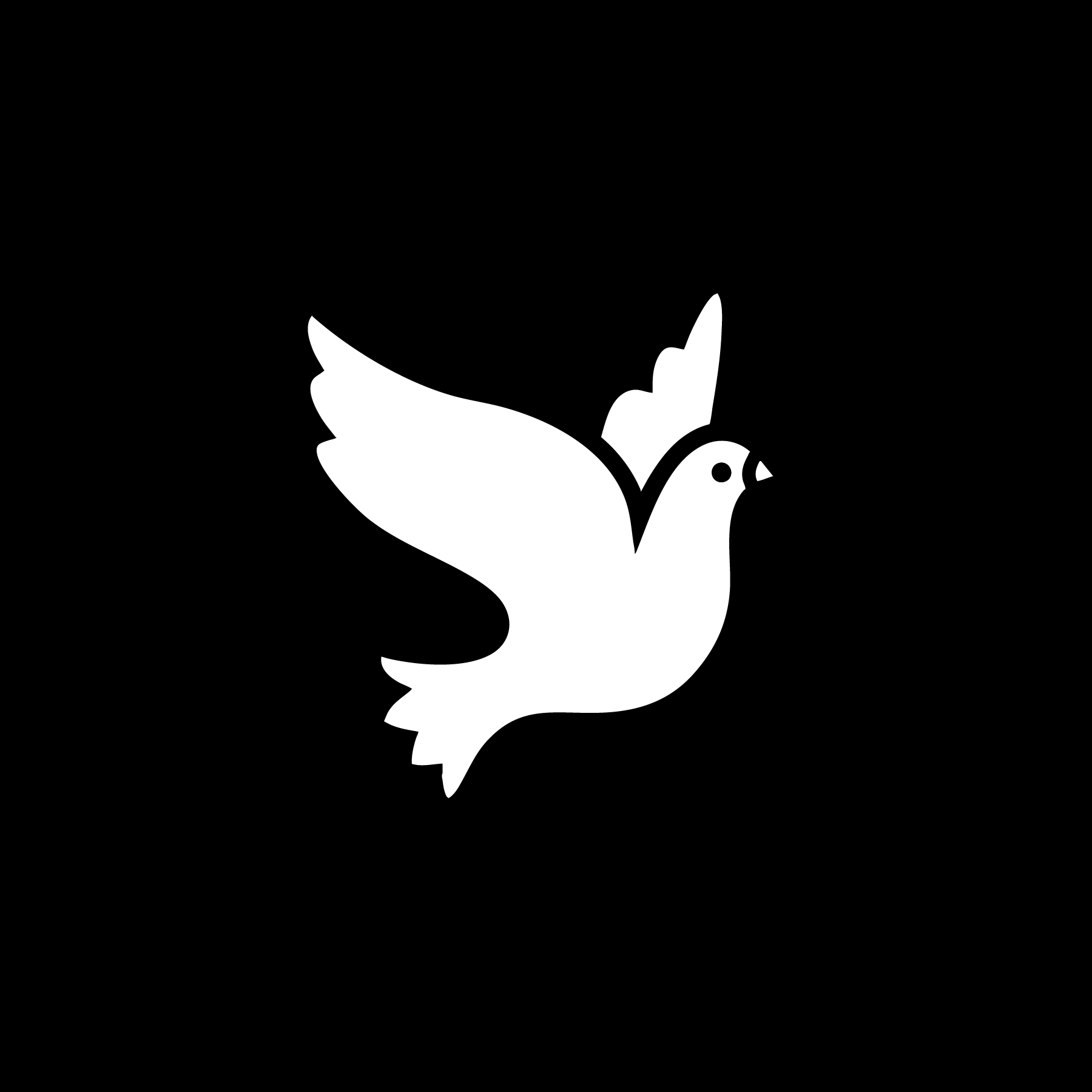
I created a multi-format visual communication project highlighting three Neotropical birds—the Bay-Breasted Warbler, Clark’s Nutcracker Crow, and Turkey Vulture—to raise public awareness about their vital ecological roles in forest preservation, seed dispersal, and pest control.
What I did
Designed a 4-color, 6” x 10” fold-out poster titled Pest Controller.
Produced a 4-minute video on the Seed Spreader bird.
Created a large interactive poster with UV ink for Scavenger (30” x 20”)
Focused on clear visual storytelling to explain each bird’s ecological importance.
Used varied media to engage different audiences and enhance message impact.
Why it matters
Raised awareness of the critical roles birds play in ecosystem health.
Educated the public on how displacement of these birds affects forests, agriculture, and pest control.
Highlighted potential environmental, economic, and health impacts if these species decline or migrate.
Promoted wildlife preservation through compelling, multi-sensory design.
I chose the word “Resplendent” as the theme for a conference poster series, creating distinct posters with rich, colorful designs that visually represent each day’s speakers and topics.
What I did
Selected the word “Resplendent” as the thematic focus.
Designed a series of posters using vibrant, sumptuous colors.
Tailored each poster’s design to reflect the specific speaker and topic of the day.
Used color and imagery to visually communicate the conference’s energy and themes.
Why it matters
Enhanced audience engagement through visually appealing, theme-driven design.
Provided a cohesive visual identity for the conference.
Helped convey the tone and importance of each session effectively.
Demonstrated skill in thematic design and event branding.
Inspired by my fascination with the German mark, I redesigned the currency by incorporating elements from comic books. Each bill visually tells a different German story: The Werewolf, The Pied Piper, and The Siren.
What I did
Redesigned the German mark with a comic book style.
Incorporated storytelling elements from German folklore into each bill.
Created unique designs representing The Werewolf, The Pied Piper, and The Siren.
Merged personal interests with cultural and historical themes in design.
Why it matters
Showcases creativity by blending cultural history with a modern artistic style.
Makes currency design more engaging and narrative-driven.
Demonstrates ability to merge personal passion with professional design work.
Highlights storytelling as a powerful tool in visual communication.
I designed a GIF for AIGA’s Design for Democracy campaign focused on bathroom equality, highlighting how bathrooms represent safety and comfort for many and advocating for equal access and inclusion.
What I did
Created a GIF centered on the theme of bathroom equality.
Used visual design to communicate the importance of safe, inclusive bathroom spaces.
Supported AIGA’s Design for Democracy initiative through impactful messaging.
Emphasized the concept of equality and unity in public spaces.
Why it matters
Raises awareness about the significance of bathroom equality and inclusion.
Encourages support for equal rights and safe spaces for all individuals.
Uses design as a tool for social change and advocacy.
Contributes to a broader conversation about privilege and accessibility.
During my summer internship, I contributed to a large ABC book project by designing the jacket for the letter “W,” using a black, silver, and red color scheme to create a striking and personalized cover.
What I did
Participated in a collaborative ABC book project during internship.
Selected the letter “W” to design the book jacket.
Created the jacket design using black and silver colors with a touch of red.
Developed a visually impactful and personalized cover design.
Why it matters
Showcased individual creativity within a team project.
Contributed to a cohesive, collaborative publication.
Demonstrated skill in color choice and visual impact.
Gained practical experience in professional design workflows.
Project Summary
This poster was created to promote a new course offered by the American Council on Education (ACM) titled Civic Dialogue, Democracy, and the Arts. The class connects students from Rutgers University and the University of Warsaw, focusing on civic engagement through artistic expression across cultural contexts. The design needed to visually reflect this international collaboration in a way that was clear, compelling, and symbolic.
What I Did
Collaborated with classmates to determine the most essential course details to include (title, description, instructors, and institutions)
Incorporated symbolic elements such as:
• The red, white, and blue of the American flag
• The Polish eagle to represent the international partnership
Refined the design to improve:
• Visual hierarchy
• Focal point
• Balance
• Proportion
Why It Matters
Effectively communicated the course’s purpose and cross-cultural collaboration.
Visually reinforces the partnership between American and Polish students through national symbols.
Demonstrated the power of design to bridge cultural and academic communities.
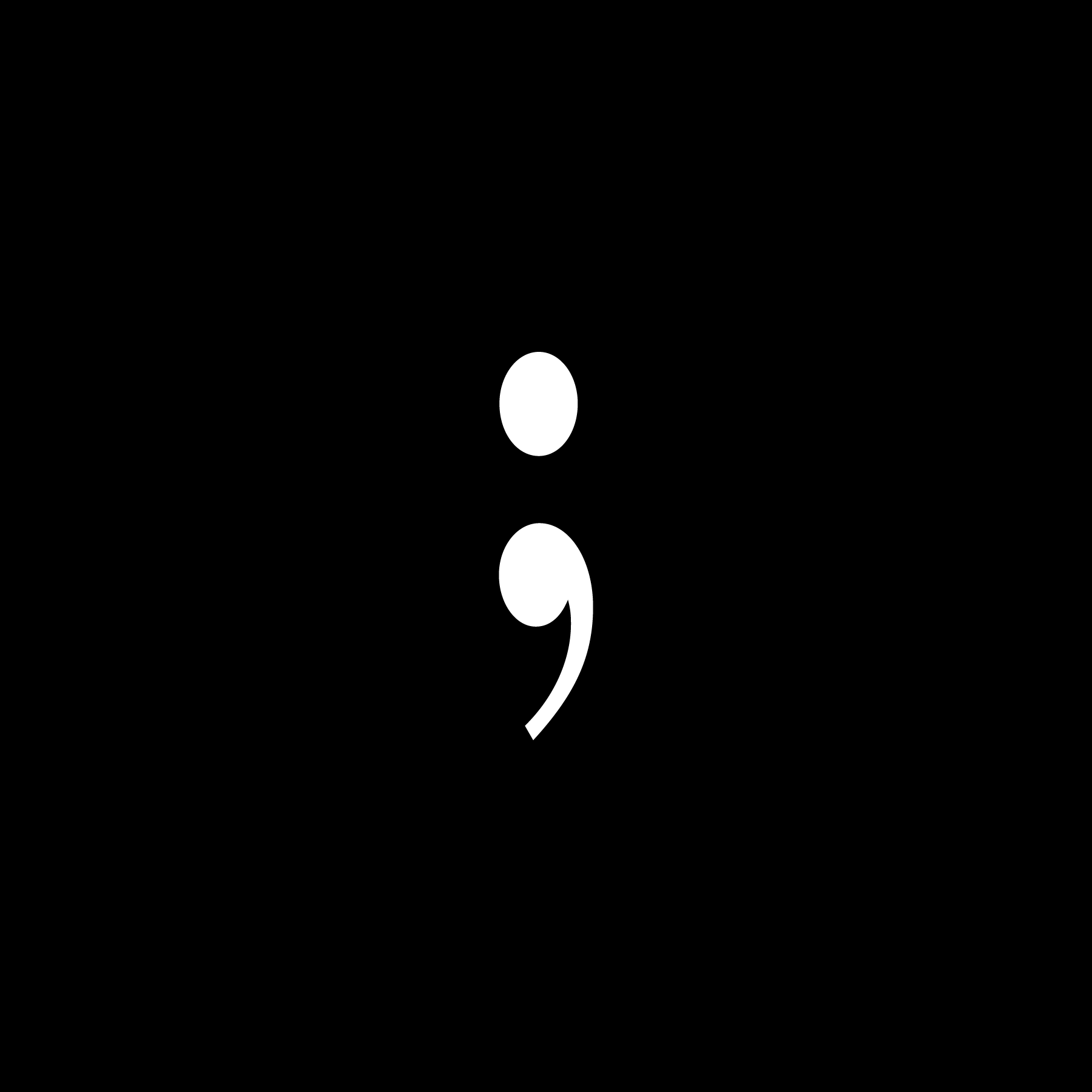
This project, inspired by personal experience, uses an interactive book and a video website to explore and communicate different perspectives on trauma, offering resources for understanding and healing.
What I did
Created an interactive book depicting two people experiencing similar trauma in different ways.
Designed a tri-fold element that transforms sentences to reveal new meanings.
Produced a video showcasing a website aimed at educating users about trauma.
Combined personal narrative with educational content to deepen understanding.
Why it matters
Provides a unique, empathetic way to engage with trauma experiences.
Offers resources to help individuals learn about and cope with trauma.
Bridges personal storytelling with broader educational outreach.
Encourages awareness and empathy through innovative design formats.